# About Me
Hi, my name is Monica, and as you may have already guessed, this is my website.
I currently live in Montréal, Quebec, Canada, where I freelance as a Front-End Web Developer.
I’ve worked with agencies, startups, and individual clients. I’m always open to new opportunities. (Email me!)
I also hover somewhere between being an artist, photographer, film and video maker.
With a caveat: These last few years I haven’t been making it a priority to maintain any serious artistic practice, though I’ve still been creating things, slowly and at my own pace. I’ve been trying to recapture some childlike joy in experimenting with new mediums - discovering new tactile and aesthetic pleasures.
Why web development?
Well, my coding journey began in 2004, at the age of 9, when I created my first petpage on Neopets.com.
For those unacquainted with the best online game on earth: a petpage is Neopets jargon for a Neopets-hosted website. Each user gets a single page to sandbox with.
Sidenote: I tried to find my petpage for you, and I did - but I guess my Photobucket account got deleted, because it currently looks like this:

The burning of the Library of Alexandria.
Despite the extremely emo poetry on my petpage, I do have fond memories of long summer days spent indoors teaching myself HTML/CSS via Lissa Explains it All. Looking back, it was a fun time to be a kid on the internet (if you avoided all the really, really bad stuff.)
There are many aspects that I enjoyed about web development back then that I still enjoy now - namely, the ability to build in real-time; problem-solving in a way that tickles my brain; putting the puzzle pieces together just to realize that they don’t quite fit; taking them apart and repeating the process over and over and over until the frustration makes way for that sweet sense of accomplishment.
But enough waxing poetic. What do I care about when it comes to web dev?
Design first - both in terms of visual design and UX, as well as code patterns, conventions, best practices - and how the former is dependent on the structural integrity of the latter.
The importance of performance, accessibility, and user experience. I’m certainly far from perfect, but I’m learning every day, and I do my part to try and make the internet a little better for everyone.
Finding the correct balance between form and function. When I say correct, I mean - building the website and then whittling it down to its final form, through which it becomes a sharper pencil - the best, most precise tool for the job.
There is a quote from Bruno Munari that I go back to whenever I’m thinking about about development and design:
“A leaf is beautiful not because it is stylish but because it is natural, created in its exact form by its exact function. A designer tries to make an object as naturally as a tree puts forth a leaf. He does not smother his object with his own personal taste but he tries to be objective. He helps the object, if I may so put it, to make itself by its own proper means [...] Each object takes on its own form. But of course this will not be fixed and final because techniques change, new materials are discovered, and with every innovation the problem arises again and the form of the object may change.”
Although this quote was published in 1966, I find it more relevant than ever - especially considering the current state of web, where there are a thousand different solutions for any given problem. I think one of the most underrated skills as a developer is learning how to filter out the noise and taking what you need for the task at hand.
About this website
This website was built using 11ty, a SSG known for its simplicity and speedy performance. I was considering using Astro, but I chose 11ty because of its native support for Liquid, a templating language that I work with daily when I'm developing for Shopify.
In lieu of components, I simply use the _includes directory to render Liquid files where I need them - it works quite nicely.
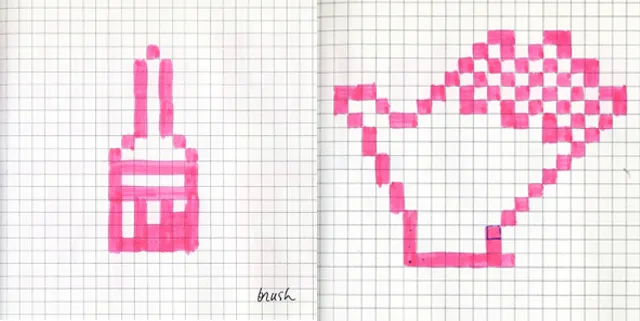
I designed all the icons on this website myself, using this brilliant piece of pixel art software called Aseprite. I was inspired, of course, by the work of Susan Kare - the undisputed queen of UI. I have to say, designing legible icons on a small grid is a lot more difficult than it seems.

A page from Susan Kare's sketchbook.
The footer UI was also highly inspired by Craig Hickman and the story behind his famous children's software, KidPix. I was thinking a lot about Craig's first two guiding principals when I was designing my website:
(The Prime Directive) The program should be extremely easy to use. No manual should be needed and program features should "explain themselves" through use. All tasks should be able to be performed in the simplest, most straightforward way. The program should go out of its way to meet the user.
As long as The Prime Directive is not violated, every opportunity should be taken to make the program surprising and satisfying to use. No opportunity should be missed. The process of making a picture should be as important as the picture produced.
If you made it this far - thank you for reading.